Four Things Every Packaging Designer — and Marketer — Should Know About Color on Press
By Garren Parker, Vice President, 3D Color
We’ve all seen the way a gorgeous package can grab the eye and pop off the shelf. That double-take moment is every designer and marketer’s north star, often the product of months if not years of research and development. Understanding the visual and emotional power of color is relatively easy; our eyes tell us all we need to know. But the technical side of how a brilliant color impression comes to life on press is far more complicated.
Whether you’re tackling your first packaging design project or your fiftieth, the principles below provide a useful guide to the basics of color management in print production; what to expect, pitfalls to avoid and how to achieve a finished product that matches — and even elevates — your original vision.
1. Colors are built, not born.
The details of commercial color printing get really technical, really fast. But the basics come down to simple math: A graphic designer working on a monitor has an infinite number of colors at her fingertips, while a print technician working on press can use only a finite number of inks. Separation is the pre-press stage when a color technician determines the most efficient way to translate every color in a design into a meticulously balanced “recipe” to build the desired colors from the available inks.
When we consider treatments like glows, fades, textures and the like, the complexity of this challenge becomes clear. Consider, also, the fact that color renders differently on different substrates, or when treated with different surface varnishes. Finally, the eye may perceive color differently depending on context, so even identical design elements can require special manipulation to appear consistent.
As the very first teams to bring a flat design into 3D reality, prototyping houses are often on the front lines of exploring color separations and other technical print considerations. A great prototyping partner will support this process by providing both technical insight and detailed documentation that sets the stage for success later on, when it’s time to print commercially at scale.
2. Design is art, printing is science.
Designers rely on instinct and artistry when applying color. For them, color is emotion, energy, contrast and movement. Yet for print production technicians, color is data; quantifiable wavelengths of light measured with a spectrophotometer. Not surprisingly, designers and print specialists don’t always see eye to eye. While designers are prone to prioritize faithful rendering of their vision above all else, it’s a printer’s responsibility to seek production pathways that are efficient and cost-effective — even if that requires a bit of creative compromise.
Because they work very closely with graphic designers, yet are also in the business of producing high-quality physical comps, experienced prototyping partners can often add value as advocates and translators in designer-printer collaborations. Building bridges among all of these stakeholder groups paves the way to smoother file hand-offs and superior final results.
3. Everyone sees color differently.
When two people look at the same sunset, do they see the same colors? How would we know? The fact is everyone sees color differently. Yet color consistency is essential when building a brand or designing a shelf set. That’s why meticulous technical color documentation during prototyping and prepress is key. While it can’t safeguard against all variance, it is the best foundation for success. It’s also important to study color chips, press drawdowns and pre-production packaging samples in an environment that mimics where the package will actually be displayed, ideally down to the details of shelf placement and proximity to light sources.
4. Explore what’s possible, print what’s practical.
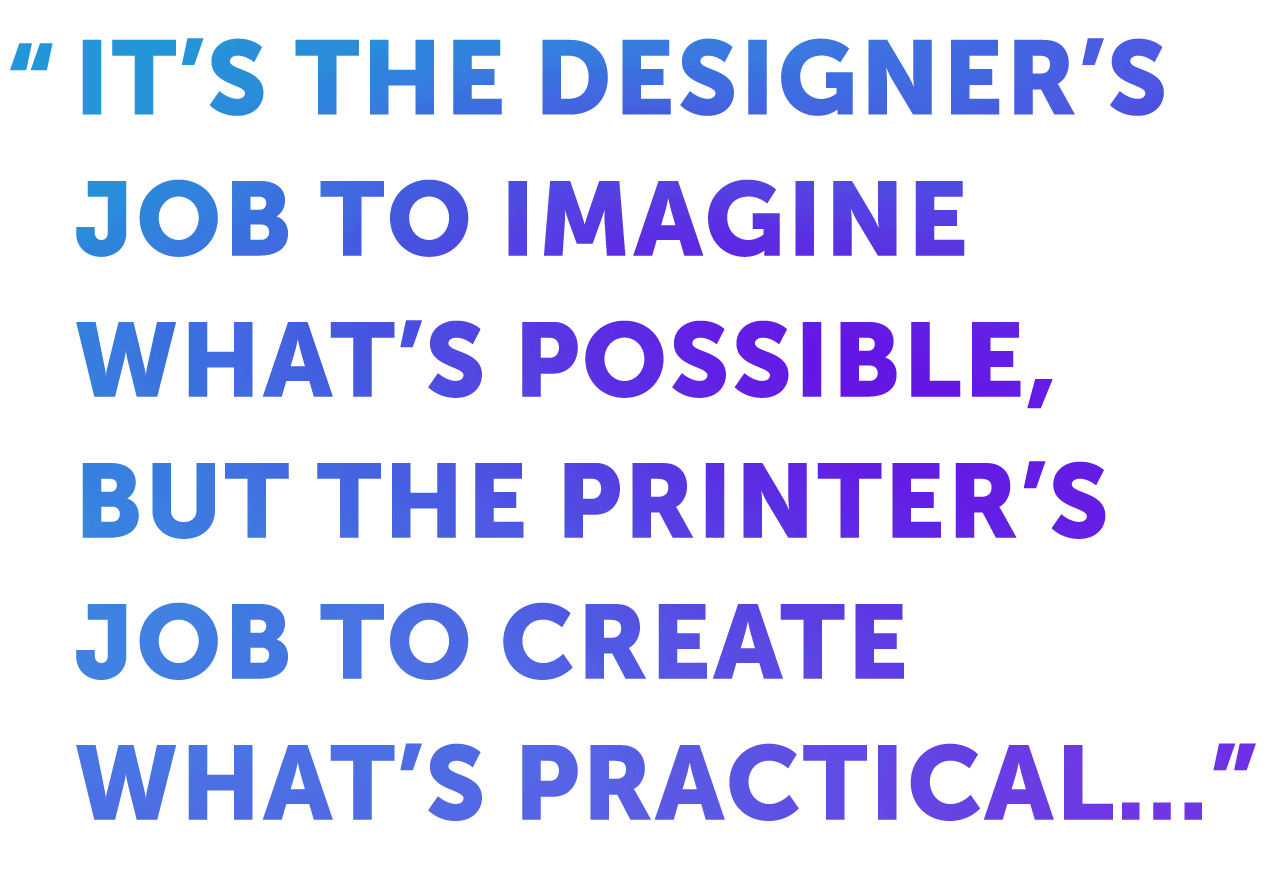
In the long journey from conceptual design to physical package, some evolution is natural. After all, it’s the designer’s job to imagine what’s possible, but the printer’s job to create what’s practical within the real-world constraints of technology, materials and budget. Again, the right prototyping partner can play an important role in bridging these two worlds.
The prototyping stage is the ideal moment to explore — or at least discuss — the best-of-the-best in materials, custom colors, fancy finishes and other details that make a package shine. Of course it’s also essential to understand early the cost implications of carrying such treatments forward at scale. For example, one might test consumer reactions to packages with and without foil embellishment to determine if the impact on purchase intent justifies the added printing cost. A savvy prototyping expert can also advise on when “good” is good enough. Sometimes a few smart trade-offs on press can dramatically lower printing costs while preserving the most important aesthetic features that drive the pack’s appeal.
The 3D Color team brings decades of combined experience in the art and science of design and print production, helping brands translate visionary ideas into standout packages. If you’d like to continue the conversation, we’d love to hear from you. Please reach out to me at garren.p@3dcolor.com or clientsuccess@3dcolor.com.
About Garren

Prior to joining 3D Color, Garren Parker gained decades of experience working hands-on with commercial printers, packaging design agencies, and technical color separation teams. His current position allows him to draw on each of these specialized disciplines. Garren thrives on helping clients combine business strategy, creativity and technical excellence to achieve the best possible packaging outcomes.